This story arose from experiences teaching English in Springvale, a Melbourne suburb. I can’t claim to be the greatest teacher but I stuck with it for over a year. We had some good laughs, and my drawing skills got a workout sketching many words and concepts.
I’d come from the States to study Southeast Asian culture at Monash University. Extracurricular antipodean anthropology also became a minor interest. And during this time Queensland politician Pauline Hanson was attracting great notoriety, her ethnocentric and xenophobic stances exploiting peoples’ anxieties about economic and social change.
Comics seem to attract controversy and censorship. When you’re a cartoonist, the first causes you tend to gravitate to are free speech issues. I appreciate the freedom of our relatively open Western media, but it also permits hate speech. And some recent statistics have shown that a rise in hate speech
leads to a corresponding rise in hate crimes. Should we limit certain types of expression if they are a clear incitement to violence?
Where do you draw the line? That’s a tough one to figure out.
Hanson is too easy a target. Less obvious but no less dangerous is the ‘structural violence’ of subtler, quieter policies already in place.
The gradual whittling away of immigrant aid and job training. The loan officer who denies a family a mortgage. The employers that use subtle racial profiling. The evacuation of businesses and services from minority communities. The predation of the gambling industry on lower-income areas.
And maybe my story takes an easy target too. Like simplistic ‘message dramas’ on TV, it’s easy to condemn the demon without, rather than the devil inside. We need stories that encourage people to confront their own prejudices and move past them. Something for the future, I think.
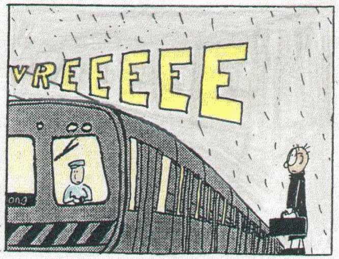
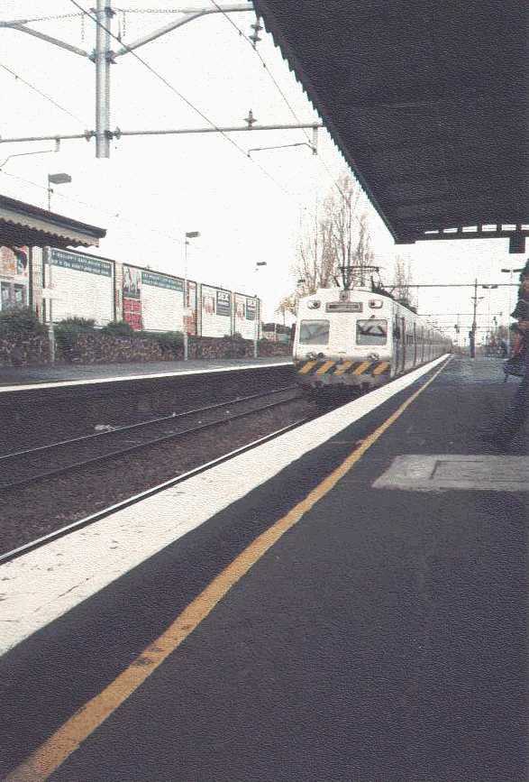
Page one, panel six: Cheers for Melbourne’s excellent public transit. (Too bad it’s all being privatized. Once it’s gone you ain’t getting it back!)
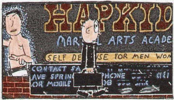
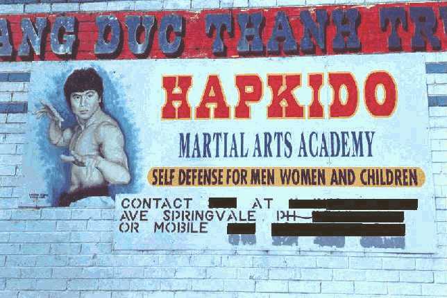
Page two, panel one: I enjoyed Springvale – far from the “Heroin City” tag touted by one Melbourne tabloid, it’s really quite peaceful and quiet, with cool funky shops.
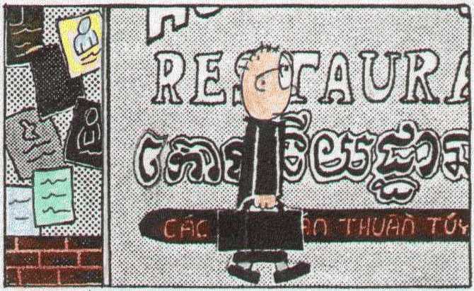
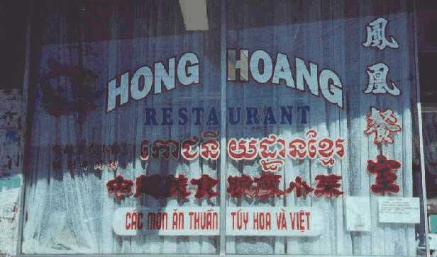
Page two, panel three: This restaurant had a fire a few days after the picture was taken.
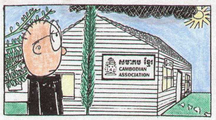
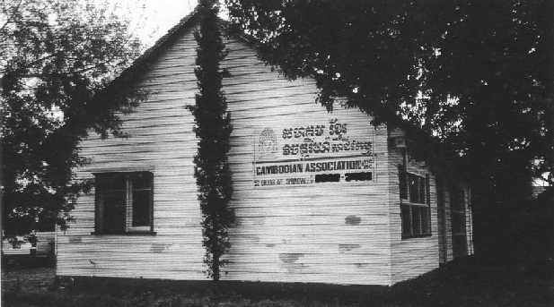
Page two, panel four: This mutual assistance agency is located in a converted house, and has a nice homey feel. Most of the interiors were white or grey, so I took some liberty with room colors in order to provide contrast.
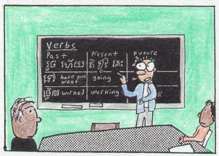
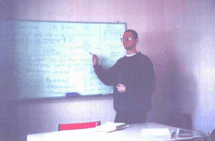
Page four, panel three: I wanted to visually indicate that certain characters were Westerners or Southeast Asian, but since I have a very simple style, I needed some visual clues. Unfortunately, the toning screens I used in the black and white version couldn’t easily be changed when I decided to color it. I just hope no one thinks the characters have the measles.
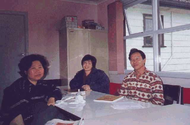
Below: a few of my bemused students.
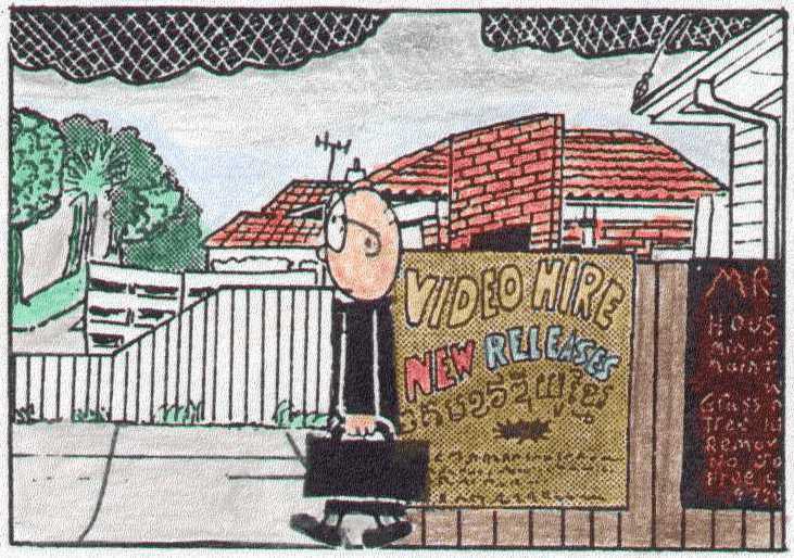
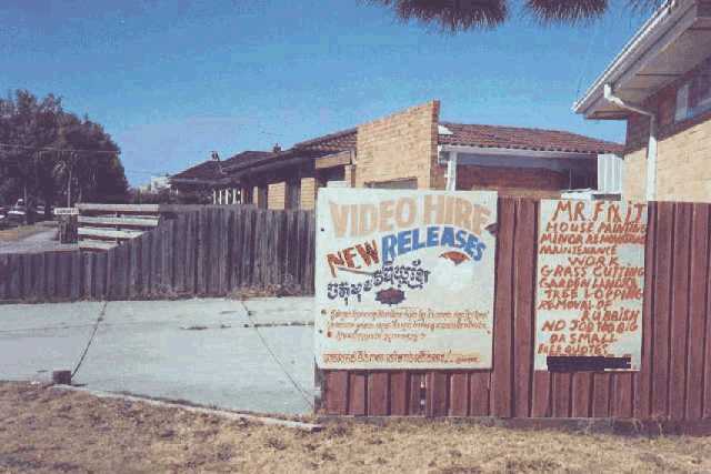
Page five, panel three. The neighborhood.
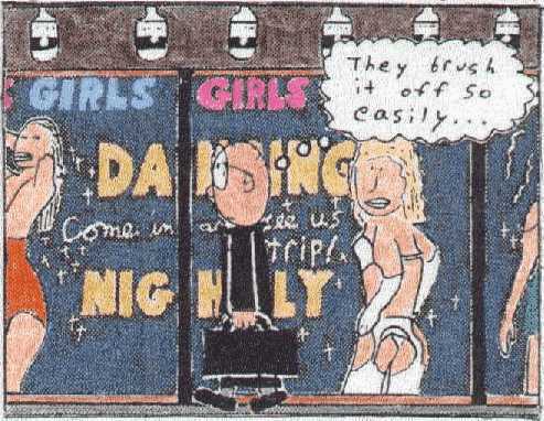
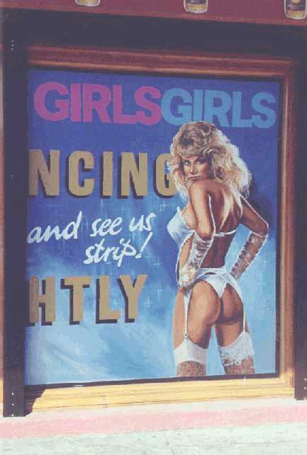
Page five, panel four: I walked past this garish sign every day I tutored. A real pathos to it early in the morning…
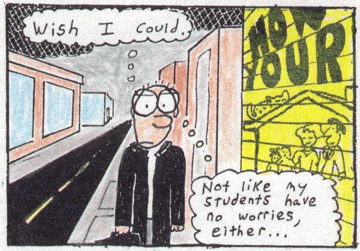
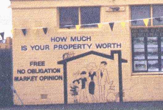
Page five, panel five: I liked this iconic mural…there are comics everywhere if you’re looking for ‘em.
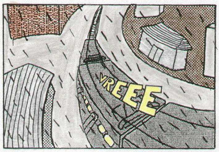
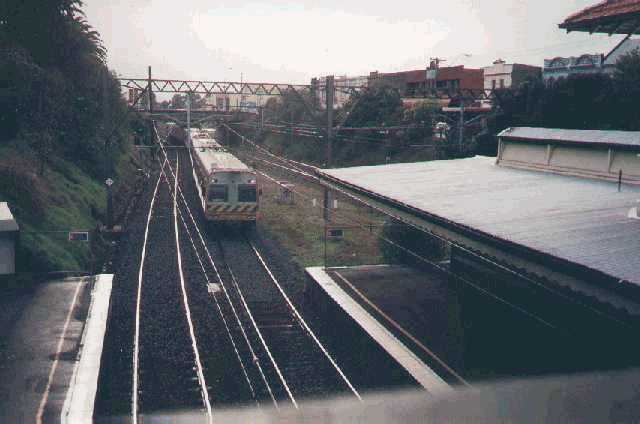
Page six, panel seven: Yay trains. These look a little dodgy ’cause I’d actually referenced two different models. Oh well. What, you think you could do better? Go ahead, draw your own comic. It’s easy.
Tags: Head Sick